This is my original photo
My rough draft
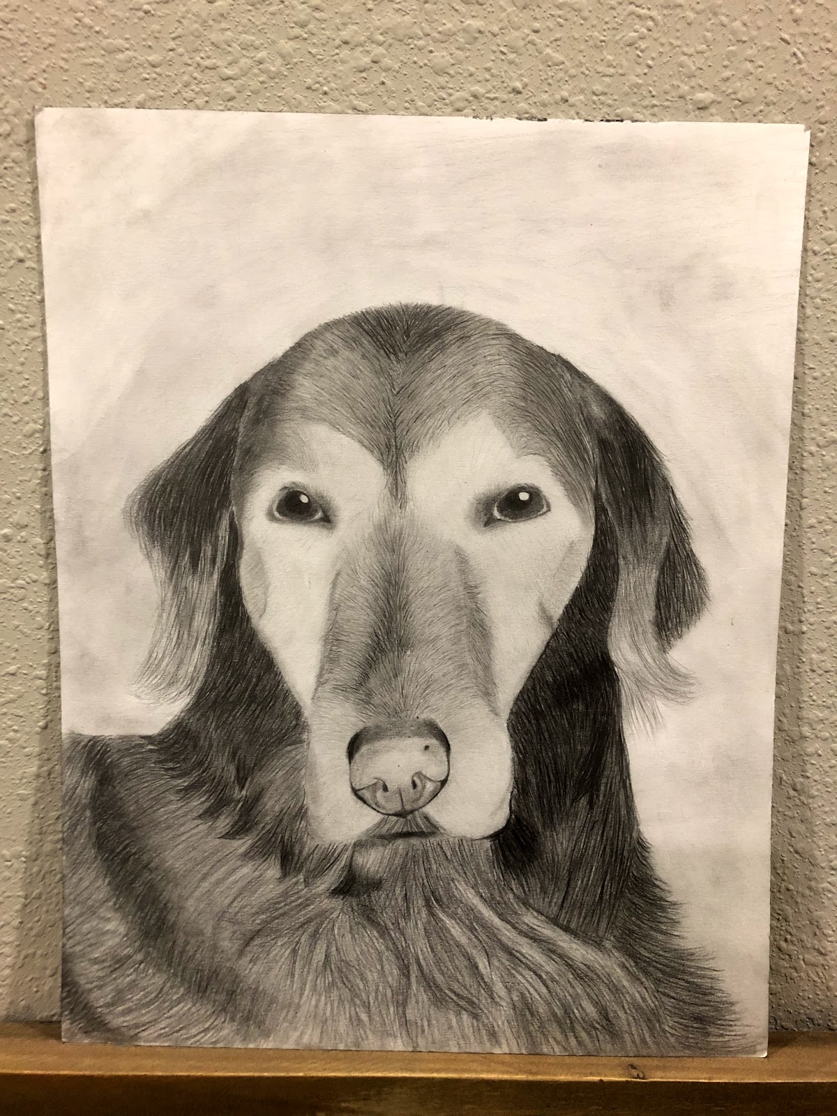
My final piece
This is the master artist
This is the current artist
The title of my piece is daisy because that was the name of my dog that I drew. To make my piece I used graphite and tried to make it look as realistic as I could. I first started out by lightly sketching the whole thing and as time went by I added more details. The details I added were highlights and shadows. By adding those things it made my piece come together and I’m very happy with it.
The composition of my blog is close up and shows my dogs whole face with out much in the background. This was my first choice for my piece and I’m glad I chose it because it turned out very well. The reasons I chose the title for my picture is because it was the name of my dog and it made sense to name it that. This drawing could be drawn in any period of time because it is a portrait. A portrait could be drawn of anyone or anything in any time period and make sense.
The meaning of my piece or the reason I drew it was because we just had to put my dog down and I wanted to draw a picture of her to remember her. Also by drawing it, it could bring joy to my family. It has a very significant meaning to my family and I. The meanings to others might not be the same but it could remind them of a pet they had or that they have. I really want people to be happy when they look at the picture.
I really like how my picture turned out but if I could change it I would spend more time on the body making it look neater and add more of the accurate shadows. I also would darken the nose to make it stand out more. I’m very happy with how the eyes turned out and the ears. The ears were one of the hardest parts to draw so I’m glad they turned out good. I’m overall very happy with how it turned out .